
A lot of people who’ve worked with me in the past know I have this thing about the fonts and colors used in marketing. In the bigger picture, that may seem to be a strange thing to highlight out of all the responsibilities we have as marketers in terms of driving conversions, purchases and leads. You might ask: “Aren’t there bigger things to worry about?” Or, “isn’t this more the realm of design?” The answer, rightly, is yes to both in most cases, but marketers need to think about such things too.
Every Detail Is Critical in Marketing – Including Colors and Fonts
Why? Consider all that you put in front of a customer – your website landing pages, ad campaigns, signage at events, brochures, emails, social media posts, etc. Inevitably, as a marketer, what you’re doing with all these “touches” is projecting your brand. If you do that in a haphazard or inconsistent way with your color and font choices, you’re basically impacting the brand narrative that you want to convey to customers. In reality, you’re diluting it because the customer can’t readily identify you from one thing you do in marketing to another.
And, as any good designer will tell you, your color choices and fonts matter in this regard. If you think about color, in particular, it has the power to evoke particular emotions and feelings within audiences, and, as such, can influence the user experience on any marketing collateral or campaign. Fonts matter too because they can also impact the user experience, especially if there are inconsistent fonts, too many fonts, or fonts that don’t quite fit the audience of a company’s products and services. Here are several ways colors and fonts influence marketing – both good and bad:
1. When You Use Too Many Colors
We see marketers and designers make a lot of mistakes when it comes to using color – especially too much color. The other day, we were on a website, for example, that had defined 58 colors in its CSS for the home page. That’s a ton! If you think about that from a brand perspective, what colors will they associate with your brand in that case? As an alternative, take a look at Shopify (below), which defines only 22 or so colors, and all of them are complimentary in terms of color scheme.
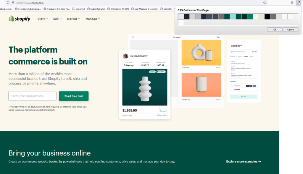
Based on its core green (which they likely chose to represent money) it expands into some gray and black tones but never strays far from its core palette. Note in the Shopify example too, that given their selectively use of colors in the CSS, any alternative colors in images can draw the eye better. If they had used too many colors on page, those would’ve likely clashed, creating a chaotic viewing experience because the eye can’t focus on any one object.
One rule: Align your color use to a brand guidelines document where you’re disciplined in the approach to a palette of colors. After all, color in a marketing context has to evoke the brand – and do it consistently. If it doesn’t do that, you’re diluting the brand value.
2. When You Use Too Many Fonts or Inconsistent Fonts with Your Brand
When it comes time to deciding on a font, there are hundreds you can consider, but a few groupings can help you narrow it down:
- Serif fonts. Did you know that serifs are the “little feet” at the end of the letter? They provide a bit more of a classic look and feel, particularly for companies seeking a more vintage look.
- Sans serif fonts. Without the “feet,” sans serif fonts are one of the more popular options for businesses, as they provide a more-modern-and-clean look.
- Display fonts. Highly stylized, these can provide a more decorative look and feel or that of a magazine-headline look.
- Script fonts. Varying from handwritten “cursive” to calligraphy, these can evoke a more personalized experience or more playful approach.
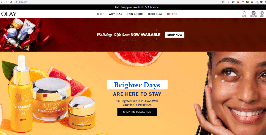
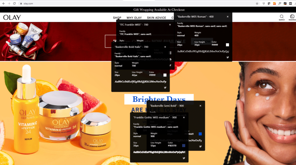
Obviously, one key point here is to make sure that a font works with the brand you want to project. As an example, many companies don’t select serif fonts if they want to project a more modern, corporate look and feel. Similarly, our recommendation: Stick with one (maybe two maximum). And use it everywhere, consistently. Too often we see companies – even larger ones that break this rule – and the result is a kind of visual chaos and inconsistency. You might hear some designers argue for a complimentary font. That’s fine in some cases but with too many, you can ruin an experience. Take a look, for example, at Olay (below):
In one window alone, the viewer gets his with 4 to 5 different font types, which does little to help create a cohesive brand narrative.
Let’s distinguish between this and Apple.com, which uses a single font (SF Pro) in all its communications, including the website. Apple simply uses different sizes of the same font. (Apple also does a great job limiting colors as well. It only uses 15 in its CSS defined on the page.)
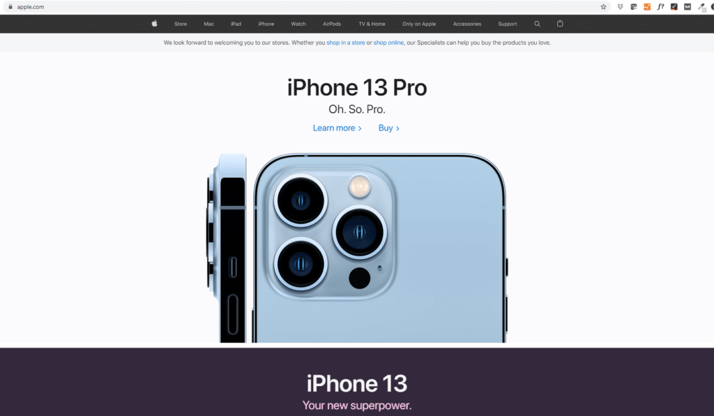
The result: A much more consistent brand and narrative in the marketplace.
3. Color Will Draw the Eye, Adding ‘Visual Weight’
There’s concept in design called “visual weight.” What it means is that they eye is drawn to certain elements based on the way they are laid out on a page, how big they are, and how they stand out generally. Color is certainly one aspect of visual weight, along with its size and the amount of whitespace around it. For example, if you have a big red button in a page of a mostly white background, it’s likely to draw the eye. That button will have added visual weight, even if it’s smaller. What happens on many pages we see is when there’s too much color – or the organization of a page doesn’t allow that color or element to stand out – so marketers are unable to draw attention to those important areas, especially calls-to-action or other buttons where users take the next step. One of our favorite examples comes from fitbit.com, which always does a great job creating visual weight on a page (below).
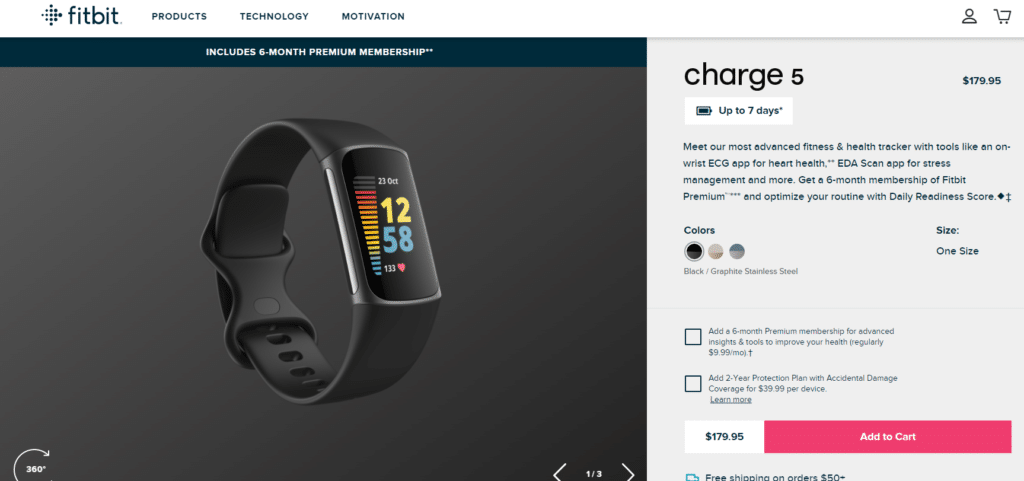
Note how the eye is drawn to three areas: 1. The elements in the watch (due to the color); 2. The headline “charge 5” (due to the size), and; 3. The call-to-action button, which stands out with its unique color on the page.
4. Color Helps Make Things Readable as a Contrast
When we speak to clients, we’ll often look at the color contrast on their websites or marketing materials. What we’ll sometimes see, in those cases (as an example), is text overwritten on an image that’s hard to read or doesn’t stand out because the color of the text is too similar to the color of the background. In this case, it’s a poor contrast ratio and it will often affect the ability of customers to navigate around a website – or even see a link. In other cases, where it’s brochure, customers might give up on reading something that didn’t have a proper contrast. The W3C (World Wide Web Consortium) – the body that recommends the open-source standards on the Internet – suggests a benchmark contrast ratio of 4.5 to 1. In the case example above, this might mean a designer has to use color to darken a background for lighter text. Or he or she has to provide some shadow around the text so it stands out more on a lighter background.
Conclusion
When thinking about both colors and fonts, our first inclination is always to suggest “less is more.” Meaning, the fewer colors, the more impactful you can be in terms of using color on a page, drawing the eye to the right elements. Similarly, using fewer fonts, you’ll help project a more consistent brand. As a marketing agency, we at Marketing Nice Guys know that every little thing you do matters. And we’ve seen that improving color and font usage can make a big difference in performance for your website and other marketing collateral. We hope this article has been helpful to you. If you need assistance in terms of designing a new experience or rethinking your own pages in terms of color, fonts, and marketing, feel free to give us a call. We’ll be happy to provide you a free consultation.